Responsive Website Design
Responsive Website Design
Responsive Website Design For Increased Customers
There has been a paradigm shift in the browsing habit of individuals on the internet due to the advent of high end and smart mobile devices which has prompted businesses to look for quality responsive design. Statistics reveal that by 2015, mobile responsive website will overtake desktop responsive website design in a big way. This has prompted clients to ask for the most professional responsive design for their websites which goes on to support multiple screen size and multiple screen resolutions. It means that your website design would be perfectly compatible to desktops, laptops as well as mobile devices.
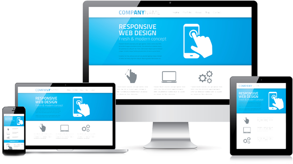
Screen resolution is one of the most vital elements of website design which needs to be kept in mind while designing a highly responsive website. Conventionally, a webpage or a website is built exclusively for a desktop but when the same website is seen on a mobile device, the alignment and resolution seems to alter or differ. This is where a responsive website design comes into play as companies are exclusively looking for such high end responsive design when it comes to designing a professional business portal with all the basic elements and features intact. Responsive design actually refers to a web page which can adjust itself accordingly to different screen size and across multiple devices, be it desktops, laptops, tablets, and smart phones.
Some Advantages Of A Responsive Website
At Website Design Company, we offer our clients a complete range of mobile friendly responsive website design since a considerable number of individuals have access to smart phones, tablets and other mobile devices.
Our team is aware of the fact that apart from having a great admin panel and superb functional aspect, Responsive allows you to gain access to multiple other design features. They put the best efforts to utilize every possible feature to improvise your online store’s performance.
Responsive website appears with a promise to render amazing browsing experience with more ease of navigation. The website content is readable on various screens as the website automatically adapts itself according to the user screen interface i.e. portrait / landscape.
Navigation turns smaller with the menu button
Texts fits beautifully in the mobile/tablet width
All images resizes to the width of the device
Footer arrange themselves one under the other